How to create custom GUI for JComboBox in Java Swing
- Details
- Written by Nam Ha Minh
- Last Updated on 04 July 2019 | Print Email
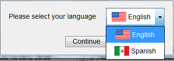
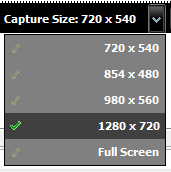
This tutorial helps you building a JComboBoxcomponent in Java Swing with custom GUI renderer, rather than its default look and feel. Sometimes, it would be desirable to have a dropdown list like the following pictures:

or:

Looks very nice, right? Let’s see how we can build such components in Java Swing. Assuming we want to create a dropdown list that allows users to select a country, as shown in the first screenshot.
1. How to create custom GUI for JCombobox
Generally, it is possible to provide a custom GUI implementation for Swing-based components by providing renderers and editors. For example:
JComboBox comboBox = new JComboBox();
comboBox.setRenderer(new MyComboBoxRenderer());
comboBox.setEditor(new MyComboBoxEditor());
The renderer class must implement javax.swing.ListCellRenderer interface. It is used to render component’s GUI in normal state. For example, the following class, MyComboBoxRenderer – implements a simple renderer which is a JLabel:
package net.codejava.swing.combobox;

import java.awt.Color;
import java.awt.Component;
import java.awt.Font;

import javax.swing.JLabel;
import javax.swing.JList;
import javax.swing.ListCellRenderer;

public class MyComboBoxRenderer extends JLabel implements ListCellRenderer {

	public MyComboBoxRenderer() {
		setOpaque(true);
		setFont(new Font("Arial", Font.BOLD | Font.ITALIC, 14));
		setBackground(Color.BLUE);
		setForeground(Color.YELLOW);
	}

	@Override
	public Component getListCellRendererComponent(JList list, Object value,
			int index, boolean isSelected, boolean cellHasFocus) {
		setText(value.toString());
		return this;
	}

}
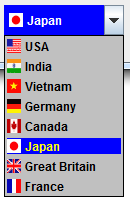
As we can see, the renderer class has to override the method getListCellRendererComponent() which is defined by the interface ListCellRenderer. The method must return a subclass of Component class which is rendered as list item in the combo box. In the example above, it returns an instance of JLabel class, and results in a combo box looks like following:

On the other hand, the editor class must implement ComboBoxEditor interface or extends one of ComboBoxEditor’s implementing classes, such as BasicComboBoxEditor. It is used to render component’s GUI in edit state. For example, the following class, MyComboBoxEditor – implements a simple editor which is a JPanel containing a JLabel:
package net.codejava.swing.combobox;

import java.awt.Color;
import java.awt.Component;
import java.awt.FlowLayout;
import java.awt.Font;

import javax.swing.JLabel;
import javax.swing.JPanel;
import javax.swing.plaf.basic.BasicComboBoxEditor;

public class MyComboBoxEditor extends BasicComboBoxEditor {
	private JLabel label = new JLabel();
	private JPanel panel = new JPanel();
	private Object selectedItem;

	public MyComboBoxEditor() {

		label.setOpaque(false);
		label.setFont(new Font("Arial", Font.BOLD, 14));
		label.setForeground(Color.BLACK);

		panel.setLayout(new FlowLayout(FlowLayout.LEFT, 5, 2));
		panel.add(label);
		panel.setBackground(Color.GREEN);
	}

	public Component getEditorComponent() {
		return this.panel;
	}

	public Object getItem() {
		return "[" + this.selectedItem.toString() + "]";
	}

	public void setItem(Object item) {
		this.selectedItem = item;
		label.setText(item.toString());
	}

}
This editor class extends the BasicComboBoxEditor class and overrides the following three methods:
- Component getEditorComponent(): returns a subclass object of Component class which is used to render the component in edit state. In the example above, the editor is a JPanel.
- setItem(Object): this method is called whenever an item is selected in the dropdown list. It is for the editor has to render the component based on the item passed. In the example above, it shows a label with green background and bold font.
- Object getItem(): returns the selected item in the dropdown list. This method is called by the JComboBox’s getSelectedItem() method.
This editor makes the combo box looks something like the following:

So far we understand the nuts and bolts of the renderer and editor for a JComboBox. Let’s see how the following nice-looking country combo box is implemented in the next sections:

NOTE: the combo box must be editable in order to use custom renderer and editor:
comboBox.setEditable(true);
2. Code renderer class for JComboBox
Code of the renderer class is as follows:
package net.codejava.swing.combobox;

import java.awt.Color;
import java.awt.Component;
import java.awt.GridBagConstraints;
import java.awt.GridBagLayout;
import java.awt.Insets;

import javax.swing.ImageIcon;
import javax.swing.JLabel;
import javax.swing.JList;
import javax.swing.JPanel;
import javax.swing.ListCellRenderer;

/**
 * Customer renderer for JComboBox
 * @author www.codejava.net
 *
 */
public class CountryItemRenderer extends JPanel implements ListCellRenderer {
	private JLabel labelItem = new JLabel();

	public CountryItemRenderer() {
		setLayout(new GridBagLayout());
		GridBagConstraints constraints = new GridBagConstraints();
		constraints.fill = GridBagConstraints.HORIZONTAL;
		constraints.weightx = 1.0;
		constraints.insets = new Insets(2, 2, 2, 2);

		labelItem.setOpaque(true);
		labelItem.setHorizontalAlignment(JLabel.LEFT);

		add(labelItem, constraints);
		setBackground(Color.LIGHT_GRAY);
	}

	@Override
	public Component getListCellRendererComponent(JList list, Object value,
			int index, boolean isSelected, boolean cellHasFocus) {
		String[] countryItem = (String[]) value;

		// set country name
		labelItem.setText(countryItem[0]);

		// set country flag
		labelItem.setIcon(new ImageIcon(countryItem[1]));

		if (isSelected) {
			labelItem.setBackground(Color.BLUE);
			labelItem.setForeground(Color.YELLOW);
		} else {
			labelItem.setForeground(Color.BLACK);
			labelItem.setBackground(Color.LIGHT_GRAY);
		}

		return this;
	}

}
As we can see, a JLabel is used for displaying an icon of country flag and country name. Its background and foreground are set differently for selected state and non-selected state.
3. Code editor class for JComboBox
The editor class is implemented as follows:
package net.codejava.swing.combobox;

import java.awt.Color;
import java.awt.Component;
import java.awt.GridBagConstraints;
import java.awt.GridBagLayout;
import java.awt.Insets;

import javax.swing.ImageIcon;
import javax.swing.JLabel;
import javax.swing.JPanel;
import javax.swing.plaf.basic.BasicComboBoxEditor;

/**
 * Editor for JComboBox
 * @author wwww.codejava.net
 *
 */
public class CountryItemEditor extends BasicComboBoxEditor {
	private JPanel panel = new JPanel();
	private JLabel labelItem = new JLabel();
	private String selectedValue;

	public CountryItemEditor() {
		panel.setLayout(new GridBagLayout());
		GridBagConstraints constraints = new GridBagConstraints();
		constraints.fill = GridBagConstraints.HORIZONTAL;
		constraints.weightx = 1.0;
		constraints.insets = new Insets(2, 5, 2, 2);

		labelItem.setOpaque(false);
		labelItem.setHorizontalAlignment(JLabel.LEFT);
		labelItem.setForeground(Color.WHITE);

		panel.add(labelItem, constraints);
		panel.setBackground(Color.BLUE);
	}

	public Component getEditorComponent() {
		return this.panel;
	}

	public Object getItem() {
		return this.selectedValue;
	}

	public void setItem(Object item) {
		if (item == null) {
			return;
		}
		String[] countryItem = (String[]) item;
		selectedValue = countryItem[0];
		labelItem.setText(selectedValue);
		labelItem.setIcon(new ImageIcon(countryItem[1]));
	}
}
The editor also uses a JLabel to display the selected country item but with different background and foreground than the renderer. It returns country name as the selected object from getItem() method.
4. Code custom combo box class
We implement a custom class that extends from JComboBox as follows:
package net.codejava.swing.combobox;

import javax.swing.DefaultComboBoxModel;
import javax.swing.JComboBox;

/**
 * A custom combo box with its own renderer and editor.
 * @author wwww.codejava.net
 *
 */
public class CountryComboBox extends JComboBox {
	private DefaultComboBoxModel model;

	public CountryComboBox() {
		model = new DefaultComboBoxModel();
		setModel(model);
		setRenderer(new CountryItemRenderer());
		setEditor(new CountryItemEditor());
	}

	/**
	 * Add an array items to this combo box.
	 * Each item is an array of two String elements:
	 * - first element is country name.
	 * - second element is path of an image file for country flag.
	 * @param items
	 */
	public void addItems(String[][] items) {
		for (String[] anItem : items) {
			model.addElement(anItem);
		}
	}
}
This combo box uses the renderer class and editor class shown above. In addition, it uses a DefaultComboBoxModel to hold items. The addItems(String[][]) method is for adding an array of items to the drop down list. Each item is also an array in which the first item is country name and the second is path of an image file represents country flag.
5. Code demo program for the custom combo box
Finally, we build a simple program which makes use the CountryComboBox class as follows:
package net.codejava.swing.combobox;

import java.awt.Dimension;
import java.awt.FlowLayout;

import javax.swing.JFrame;
import javax.swing.SwingUtilities;

public class CustomComboBoxTester extends JFrame {

	public CustomComboBoxTester() {
		super("Demo program for custom combobox");
		setLayout(new FlowLayout());

		CountryComboBox customCombobox = new CountryComboBox();
		customCombobox.setPreferredSize(new Dimension(120, 30));
		customCombobox.setEditable(true);
		customCombobox.addItems(countryList);

		add(customCombobox);

		setDefaultCloseOperation(JFrame.EXIT_ON_CLOSE);
		setSize(400, 100);
		setLocationRelativeTo(null);	// center on screen
	}

	public static void main(String[] args) {
		SwingUtilities.invokeLater(new Runnable() {
			@Override
			public void run() {
				new CustomComboBoxTester().setVisible(true);
			}
		});
	}

	private String[][] countryList = {{"USA", "us.png"},
									  {"India", "in.png"},
									  {"Vietnam", "vn.png"},
									  {"Germany", "de.png"},
									  {"Canada", "ca.png"},
									  {"Japan", "jp.png"},
									  {"Great Britain", "gb.png"},
									  {"France", "fr.png"}};
}
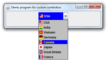
The demo program is a JFrame window that contains only one combo box and declares a countryList array which holds a list of items added to the combo box. When running, it looks like the following screenshot:

You can download the zip file for both Java source files and flag images.
Related JCombBox Tutotrials:
Other Java Swing Tutorials:
- Java Swing Hello World Tutorial for Beginners Using Text Editor
- JFrame basic tutorial and examples
- JPanel basic tutorial and examples
- JLabel basic tutorial and examples
- JTextField basic tutorial and examples
- JButton basic tutorial and examples
About the Author:
 Nam Ha Minh is certified Java programmer (SCJP and SCWCD). He began programming with Java back in the days of Java 1.4 and has been passionate about it ever since. You can connect with him on Facebook and watch his Java videos on YouTube.
Comments
First thank you for your great job here.
I am now working on a Java project, and I am using WebLaF v1.2.14 as my main L&F, the problem is that I have some issues and can't contact WebLaf team, so you're my hope.
I have already describe my problem here :
stackoverflow.com/.../...
I would appreciate your help.
Thanks in advance.
ImageIcon iconCountry = null ;
selectedValue = countryItem[1];
iconCountry = new ImageIcon(getClass().getResource(selectedValue));
labelItem.setIcon(iconCountry);
labelItem.setIcon(iconReturn);
need to make method
-----------------------------------
public ImageIcon Changeicon(String str){
ImageIcon icon = null ;
if(str.equalsIgnoreCase("USA")){
icon= new ImageIcon(getClass().getResource(
"/images/us.png"));
return icon;